
The Beauty of Warm Neutrals
Updated: Sep 30
Warm neutrals have a way of making a home feel both timeless and inviting. Soft creams, warm whites, natural linens, and organic wood tones create a beautiful foundation that feels calm, layered, and effortlessly livable. Rather than feeling plain, these hues allow thoughtfully selected furnishings to take center stage.

Soft draperies frame the room with warmth, gently filtering natural light throughout the day.
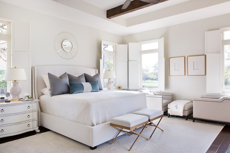
Cream colored furnishings provide a timeless backdrop that complements a variety of design styles.
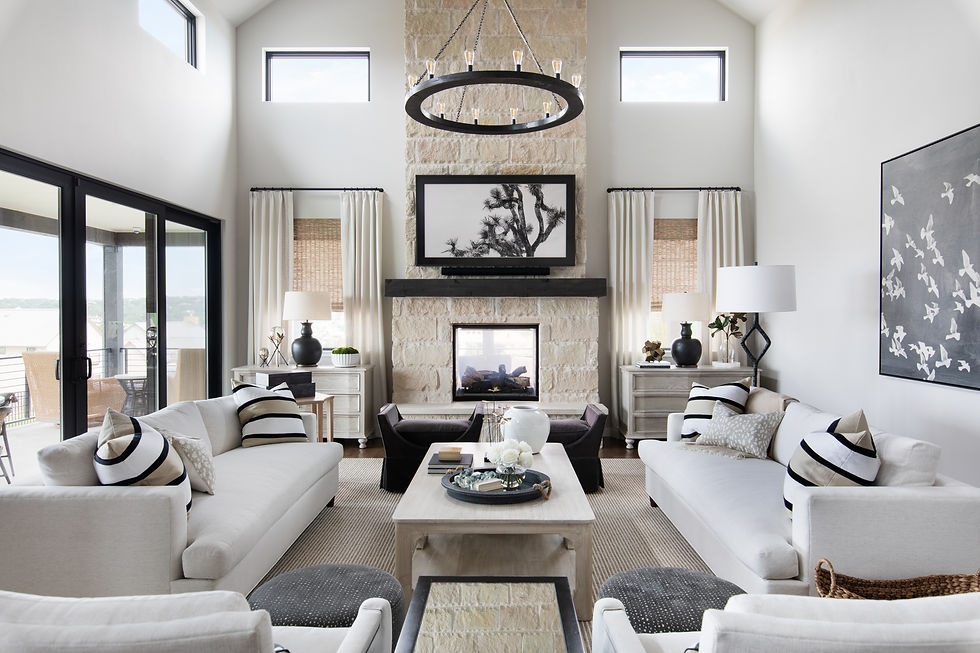
Layering shades of ivory, cream, and taupe creates depth while maintaining a serene, cohesive feel.

A palette of warm neutrals allows architectural details and custom finishes to shine.

Neutral tones create a timeless backdrop that feels equally suited for everyday living and entertaining.

Warm neutrals never go out of style. Their versatility and timeless appeal create interiors that feel welcoming today and will continue to feel beautiful for years to come.


A Gray Screen is useful in real-time interior design when checking how neutral colors appear on a computer or laptop display. For example, designers can use a solid gray background to inspect color tint, monitor brightness, and display uniformity while reviewing warm beige, cream, and gray furniture palettes.